Basics of Facebook Litho – a Declarative UI framework for Android
Facebook this year released Litho, a declarative UI framework primarily for rendering complex lists.
Litho is a library which allows us to create complex UIs declaratively with optimizations under the hood.
Inspirations from React
Litho is inspired by React, which is a declarative framework for web front-end. We declare what the UI should look like based on data. Each UI is considered a Component (for e.g. TextView, ImageView, EditText, etc.).The data is passed to the component as variables annotated with Props. Props are immutable values. We can only use it, but cannot change it. But how do you handle state changes without changing data? For that we use annotation called State. States can hold values that may change. We can create states inside components. And perform an event to change the state, which causes the component to re-render to make the changes visible.
In Litho, we declare what the UI should look like and at compile time, it generates the actual code for the component. Finally all the components are wrapped inside a root ViewGroup called LithoView.
We need not do any kind of layout design in XML since every view we render has be declared through code.
Using Litho has several performance benefits. When you are creating a complex list of items, it will be very useful.
How Litho Optimizes
Litho optimizes the layouts by the following ways:- Asynchronous Layout - Litho does the measure and layout of views in background thread ahead of time preventing the need to block the UI thread.
- Flatter Views - Litho helps us reduce the number of ViewGroups needed by internally making use of Yoga, another layout library from Facebook.
- Fine-grained recycling - It recycles each views in an item separately. This enables to reuse the views in any item. This removes the need of having multiple view types since one view from a view type can be reused on another view type.
How components are created
Litho uses annotation processor to generate the actual components that need to be rendered. Popular libraries like Butterknife uses annotation processing to generate the required code.In Litho we must create a Spec class where we declare what are the components needed and how they should look. So a Spec class is where we declare what needs to be rendered. And at compile time, the code generation happens based on this class.
To create a spec class we must suffix the class name with the word Spec. And this class should be annotated with some Spec annotations.
For example to render a layout we must create a Spec class annotated with @LayoutSpec. This annotation allows Litho to understand that this is a Spec class and it should generate code for the actual component. The LayoutSpec annotation is used to render layouts.
Similarly to create custom views and drawables (not ViewGroups), we use the @MountSpec annotation. Litho provides built-in components for ImageViews, TextViews, etc. You can look at all the components available here.
OK. Now let us learn how to create components.
To start, we must include the necessary dependencies:
Library dependencies
I am using Android Studio 3.0.1 and Litho version 0.12.0Litho dependencies:
// litho
implementation 'com.facebook.litho:litho-core:0.12.0'
implementation 'com.facebook.litho:litho-widget:0.12.0'
compileOnly 'com.facebook.litho:litho-annotations:0.12.0'
annotationProcessor 'com.facebook.litho:litho-processor:0.12.0'
SoLoader:
Litho uses Yoga, a layout engine responsible for flatter view hierarchies. Since Yoga uses native C++ code, to load them we use the SoLoader dependency:
implementation 'com.facebook.soloader:soloader:0.2.0'
Next in your Application class' onCreate(), initialize the SoLoader:
SoLoader.init(this, false);
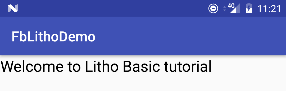
Now let's try creating a simple component. We will create a TextView with some text in it.
Create a simple Text Component
Litho provides several built-in components. For TextView it has aText component. So we need not create any spec class.
Component text = Text.create(c)
  .text("Welcome to Litho Basic tutorial")
  .textSizeSp(22)
  .build();
Here we create a Text component passing in a context. Litho provides a built-in class which wraps the activity context called ComponentContext. This is how we create it:
final ComponentContext c = new ComponentContext(this);The
Text.create() returns a component builder subclass which exposes the attributes of the component like setting text, text size, text color, etc. Finally we call build() to return the Text Component.
Now in our Activity's onCreate() we call setContentView() passing in the LithoView. As described earlier LithoView is the root container that wraps all the components. Here it wraps the Text Component:
final LithoView lithoView = LithoView.create(c, text);
setContentView(lithoView);
This outputs the below screen:
OK. Looks good. Now let's create a component with two Text components in it, one for title and another for description.
LayoutSpec - Create a Layout with multiple child views
For this we need a layout that wraps the two texts. So let's create a layout spec class. I call thisMyComponentSpec annotated with @LayoutSpec.
To create a layout we must implement a function annotated with @OnCreateLayout:
@OnCreateLayout
static Component onCreateLayout(final ComponentContext c) {
}
This function provides a ComponentContext as parameter which we can use to create child components.
This is how the code looks like after creating child components:
@LayoutSpec
public class MyComponentSpec {
@OnCreateLayout
static ComponentLayout onCreateLayout(final ComponentContext c) {
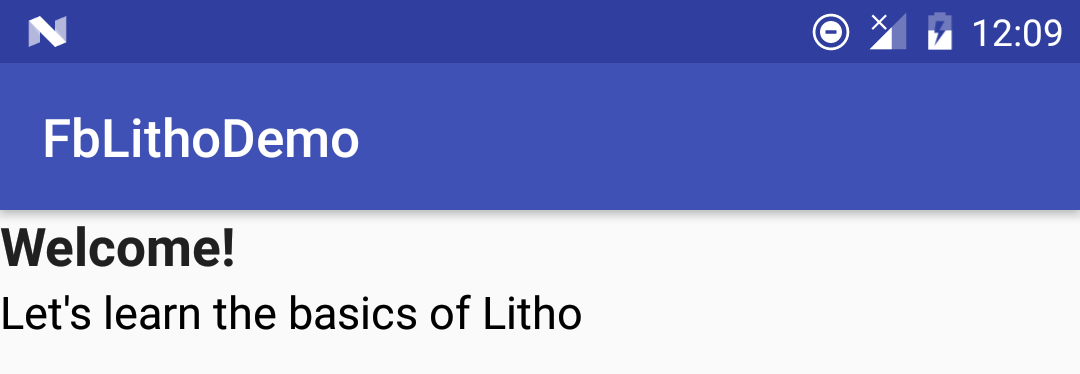
Component title = Text.create(c, 0, R.style.TextAppearance_AppCompat_Title)
.text("Welcome!")
.typeface(Typeface.defaultFromStyle(Typeface.BOLD))
.build();
Component description = Text.create(c)
.text("Let's learn the basics of Litho")
.textSizeSp(17)
.build();
return Column.create(c)
.child(title)
.child(description)
.build();
}
}
Notice here that we create the title and desription Text components and pass them as children to Column. Column creates a container to wrap the children and render them vertically one below another. To render the children horizontally it provides a Row class.
This is how the screen looks:
The alignments of the components are done by the Yoga framework. It uses APIs similar to flexbox for laying out components. To know the concepts of flexbox check this site.
To center align the texts horizontally, call alignItems(YogaAlign.CENTER) on Column.
Border Styles
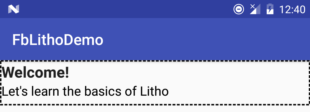
Litho also provides ways to set border styles. If you want to display a dashed line border for a component, simply call theborder() and pass a Border:
Column.create(c)
  .child(title)
  .child(description)
  .border(
    Border.create(c)
      .color(YogaEdge.ALL, Color.BLACK)
      .widthDip(YogaEdge.ALL, 2)
      .dashEffect(new float[]{10f, 5f}, 0f)
      .build()
  )
  .heightDip(60)
  .build();
This is how it looks:
Prop - Passing values to components
Now let's pass some dynamic texts to show in Text components. For this we use@Prop annotation.
Since we need to display title and description, we will pass two props:
@OnCreateLayout
static Component onCreateLayout(
  final ComponentContext c,
  @Prop String title,
  @Prop String desc
) {
   //...
}
After specifying them, build the project. Now the necessary code will be generated which you can call from your Activity:
final LithoView lithoView = LithoView.create(
  c,
  MyComponent.create(c)
    .title("This is a dynamic title")
    .desc("Here is the description")
    .build()
);
Notice that we can access title and desc prop to set the title and description. So that's how you pass props to a component.
Remember that you cannot change the prop value from the component. Props are immutable.
Events and State changes
Since Props are immutable, we cannot use them to perform UI state changes. For this Litho provides a@State annotation. Variables annotated with this may denote the state of a UI component. So whenever an event occurs, we can alter the value of the state variable. This will trigger a re-render of the component.
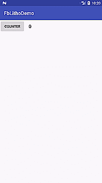
For this, let's create a counter. Each time when a Button is pressed the counter will be increased by 1.
The count is displayed by a Text component. The initial value will be 0. Since the count needs to be changed, we will use @State to specify the count value.
To specify the initial value we must override the @OnCreateInitialState method. It takes a ComponentContext parameter and a StateValue variable. The StateValue variable is a wrapper around the state. Here we use a integer to specify the count.
This is how the method looks like:
@OnCreateInitialState
static void createInitState(
  final ComponentContext c,
  StateValue count
) {
  count.set(0);
}
You can specify a StateValue for each State variable you want to initialize.
We can access the count State from onCreateLayout method like how we access a prop:
@OnCreateLayout
static Component onCreateLayout(
  final ComponentContext c,
  @State int count
) {
}
Next, we have to create a Button to change the counter. Since there is no widget for Button in Litho, we can create one using the @MountSpec annotation. We can create views and drawables with this annotation.
So our Button component will look like this:
@MountSpec
public class CounterButtonSpec {

  @OnCreateMountContent
  static Button onCreateMountContent(ComponentContext c) {
    return new Button(c);
  }

  @OnMount
  static void onMount(
    ComponentContext c, Button button) {
    button.setText("Counter");
  }

}
Here we must implement at least the OnCreateMountContent function. This is where we return what view or drawable we want to create.
In @OnMount the second argument will always be the view/drawable that we create. Here it is Button. In this method we set the text.
And in our LayoutSpec class we can render this along with the count Text component as follows:
@OnCreateLayout
static Component onCreateLayout(
  final ComponentContext c,
  @State int count
) {

  Component textComp = Text.create(c)
    .text(String.valueOf(count))
    .textSizeSp(18)
    .build();

  Component buttonComp = CounterButton.create(c)
    .widthDip(100)
    .heightDip(48)
    .marginDip(YogaEdge.RIGHT, 16)
    .build();

  return Row.create(c)
    .child(buttonComp)
    .child(textComp)
    .heightDip(50)
    .alignItems(YogaAlign.CENTER)
    .build();

}
Now the UI looks as below:

Next we want to update the count when the button is pressed every time.
To handle click event, we must implement a event of type ClickEvent which is equivalent to Android's onClick method.
@OnEvent(ClickEvent.class)
static void onButtonClick(final ComponentContext c) {
}
Next the state can be updated from a method annotated with @OnUpdateState. Here we can use the StateValue parameter to update the count.
@OnUpdateState
static void updateCount(StateValue count) {
  count.set(count.get() + 1);
}
After we build the project, we can call this method from the click event.
MyComponent.updateCount(c);
You can also pass any parameters to the onButtonClick() call which can be accessed from the update method by annotating the parameter with @Param.
Finally we should set the click event handler on the component builder. We can set it using clickHandler():
Component buttonComp = CounterButton.create(c)
  .widthDip(100)
  .heightDip(48)
  .clickHandler(MyComponent.onButtonClick(c))
  .marginDip(YogaEdge.RIGHT, 16)
  .build();
Now when you run the app you can update the count.
That's it. Now you should have understood the basics of how UIs can be rendered using Litho.
My next post will cover creating a complex list using Sections API.
Sections API is a new feature that was added to Litho recently which supports most of RecyclerView features under the hood including calculating changes in data using DiffUtil on a background thread. The Sections API allows creating complex RecyclerViews easily.Until then you can learn more about Litho and Sections from the official docs.
References: